
A little while back I put together a few screenshots of what I figure will be the future of the Windows UI (or at least what I’d like it to be). Today I’ve put together something slightly different that complements the previous post.
I like Windows 8.1 on a tablet. The multitasking features are really nice, the live tiles are cool, and the UI generally feels smooth. Obviously, I have some reservations about the OS on a desktop, which I mentioned before, but it’s not a long way away.
A defining characteristic of Windows 8 when it first came out was it’s flatness, cleanliness, and starkness in the UI. At a time when other OS’s clung to a skeuomorphic approach, Metro was radical. But then iOS followed suit and went flat.
Metro is decent, but I’ve always felt like it has sacrificed some usability in trying to achieve simplicity. The two are by no means mutually exclusive, but at times I’ve been frustrated at Microsoft’s approach to simplifying.
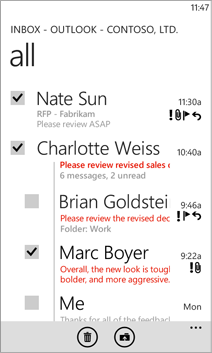

Take mobile mail for example. Both the Windows 8 Phone mail app and iOS 7 mail app are very white and aim to be extremely simple. The biggest difference is that Apple is willing to use lines to separate regions where Microsoft does that with only typography. The result is that ths iOS app is better at providing context and ends up being a bit easier to navigate.
This is a theme in Windows 8 (not phone) too– the OS often disregards lines and shading in order to be “cleaner”, but it ends up looking a little clunkier and harder to differentiate different content.
Below, I’ve taken a look at how Windows could refine the Mail app going forward (as an example). In addition to what I’ve mentioned, the concept adds text alongside icons, adds a combined inbox (why don’t we have this yet?), and uses some modified spacing and font sizing. Here it is, with the existing app for comparison:


And of course, per my last Windows post, I’d expect to be able to pop the app out onto the desktop:

And now a similar vision for Skydrive:

And a few more:


Anyway, tell me what you think!


